TWAALFMAAL / of 1 / More info
My contribution to the new calendar by @twaalfmaal for the month of October 2025. Made with cunei, a typeface made together with @nemo.lemoine during his internship. (Inspired by the ancient cuneiform script, one of the oldest known writing systems) The idea was simple: create a typeface using only triangles. However, the real challenge came in refining those initial concepts into a cohesive design. After numerous iterations, we finalized the typeface. For the layout, we wanted to showcase the typeface as big as possible, without losing the functionality of the calendar.
The calendar features a new designer each month. Look at the other artworks on their instagram. You can buy it for 35 euro at www.twaalfmaal.be

Abrupt, 2024 / of 3 / More info
We were asked to do the art direction of the brand new brussels-based festival called Abrupt. To kick off the release, we collaborated with motion designer Vincent Van Lieshout to create the featured campaign video. Be sure to check out the new website coded by Studio Dier / www.abrupt.brussels
We worked around the idea of “portals”. We regard music as a transformative force that guides listeners through various spaces and dimensions, each genre offering a unique auditory journey. Our visuals reimagines music as an art form capable of instantaneous travel, transcending time and bridging different universes.
Project together with graphic designer and artist Victor Verhelst. Thank you to all parties involved for trusting this style and letting it grow with the festival


Konvooi, Booklet, 2022 / of 7 / More info
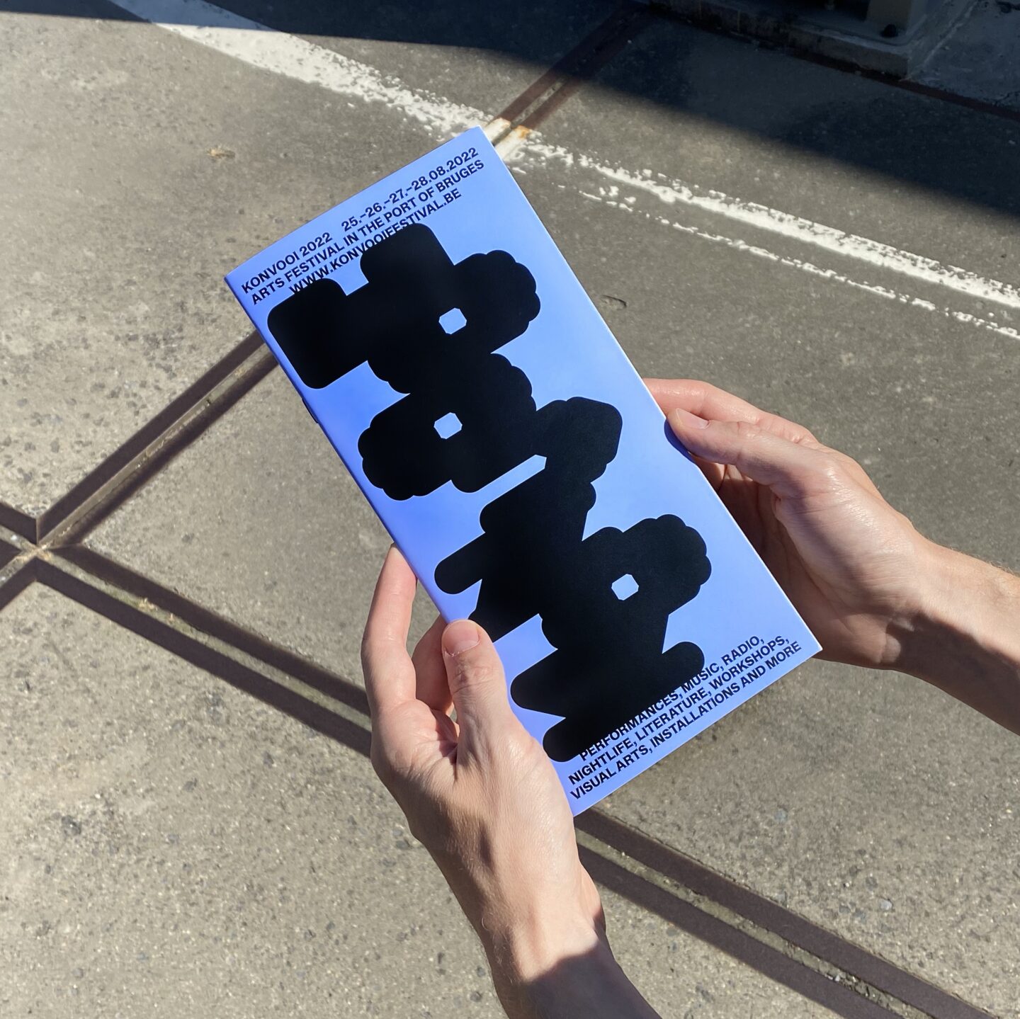
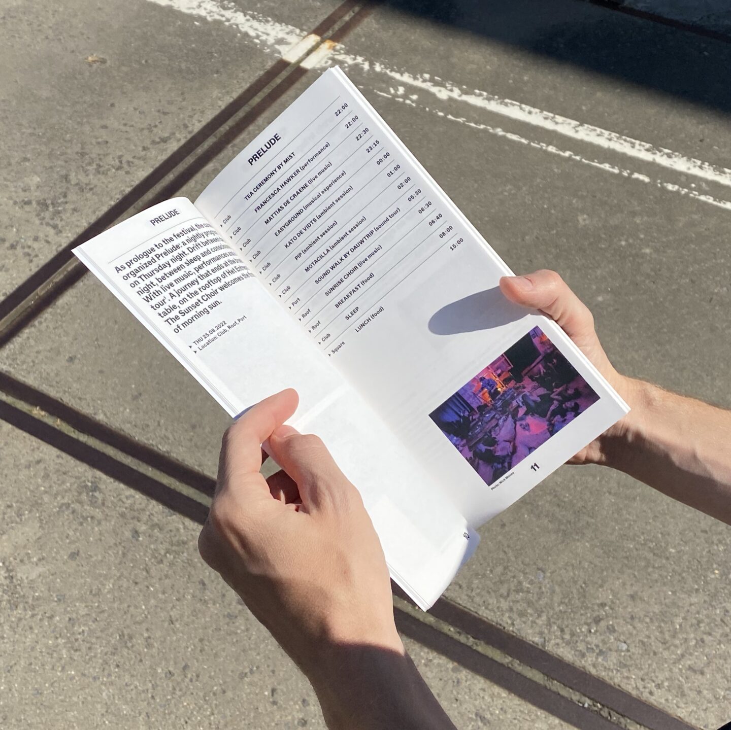
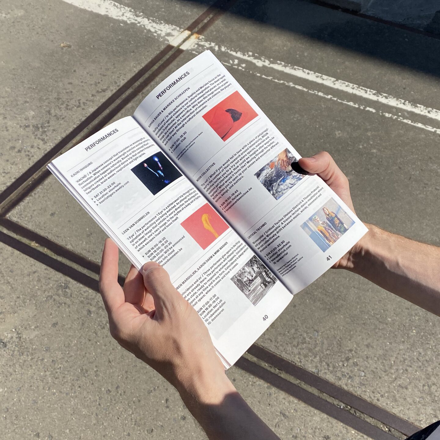
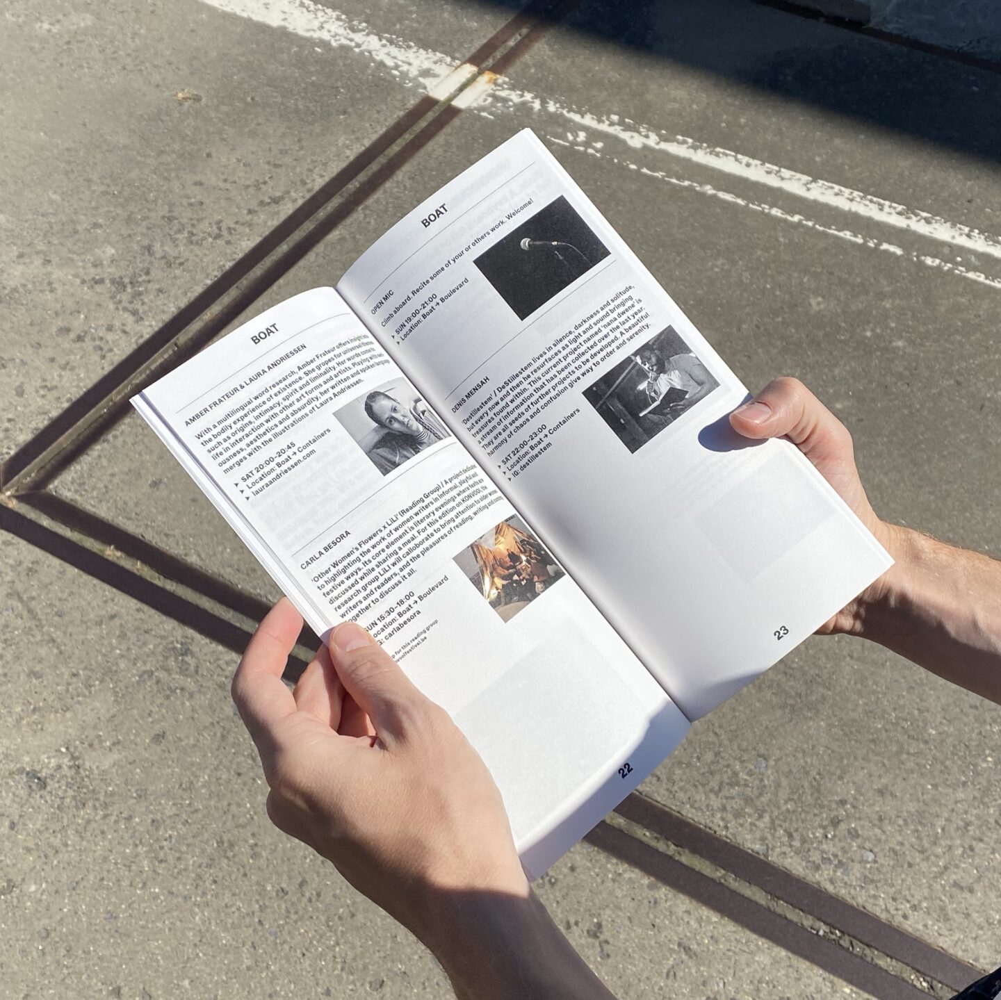
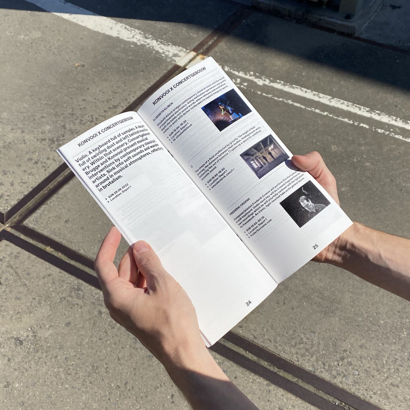
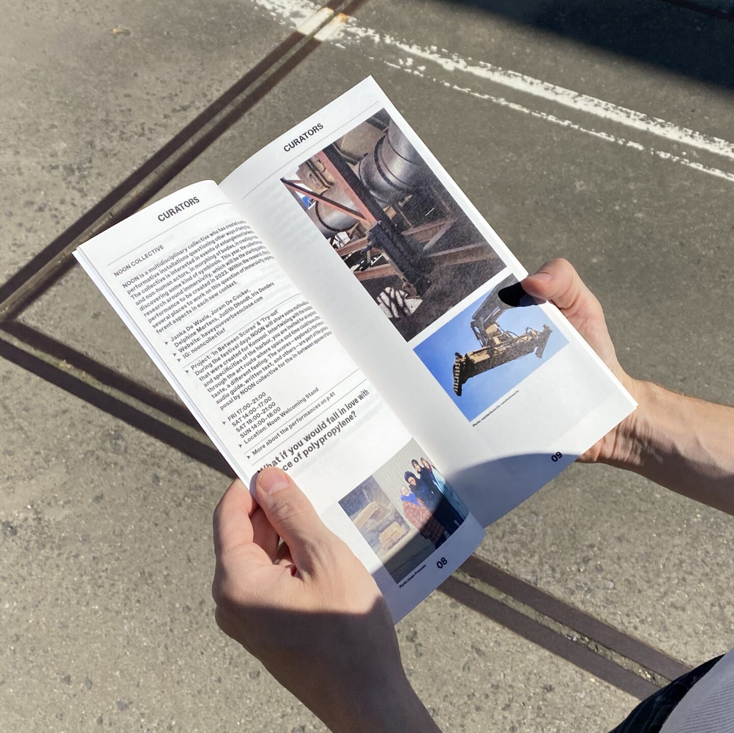
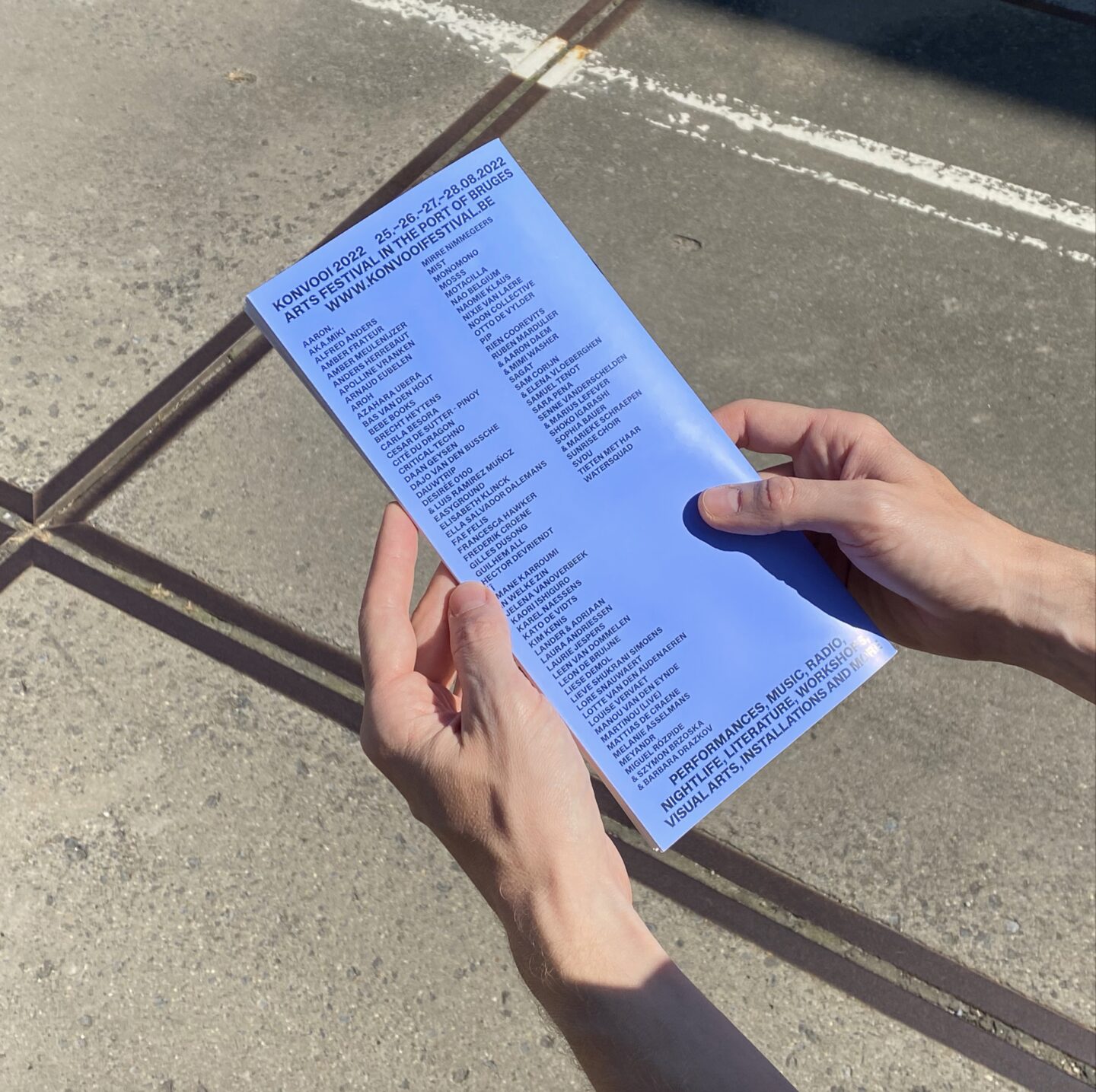
Identity and program with timetable and art route booklet for Konvooi 2022. Konvooi is an annual multidisciplinary music and arts festival. Located close to youth culture centre Het Entrepôt in Bruges. It provides young artists/collectives a trajectory, a budget and the responsibility to co-curate the festival. For the identity of Konvooi we selected a stencil typeface and started to deform these letters into almost unreadable shapes. We liked the idea that this deformation looked like wet ink dripping from a wall. The composition of these letters visualize a convoy. A shape or group of vehicles, normally used in military strategies, to benefit a defensive purpose. This project was made together with graphic designer Otis Verhoeven and Lennart Van den Bossche. Typefaces we used in this publication were Mineral by Benoit Bodhuin and Helveesti by ABC Dinamo. Every year het Entrepôt is looking for new young and upcoming curators for Konvooi or other festivals and events, be sure to give them a call if you are interested in curating a festival.
Ramble Song by Berlin, 2021 / of 4 / More info
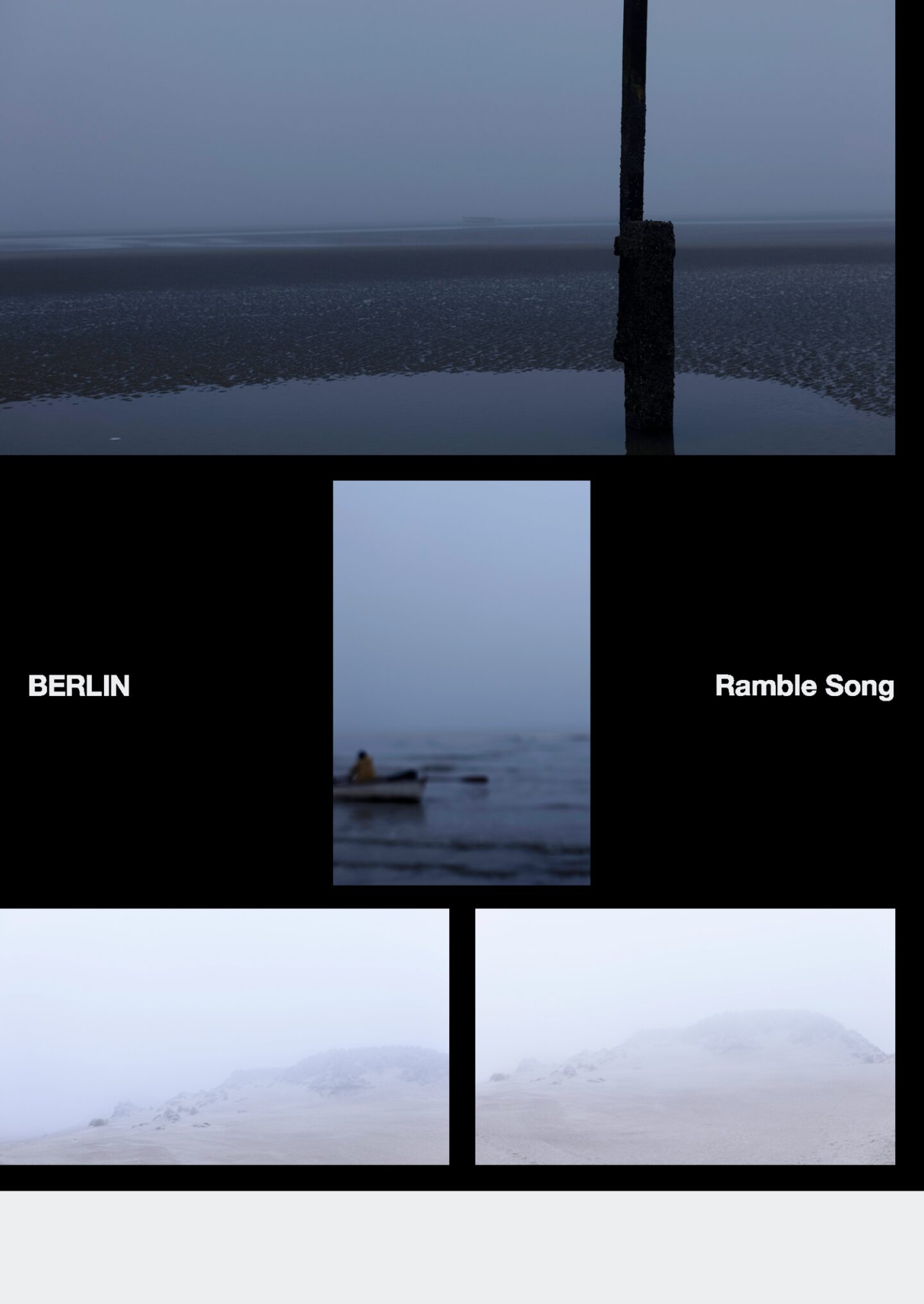
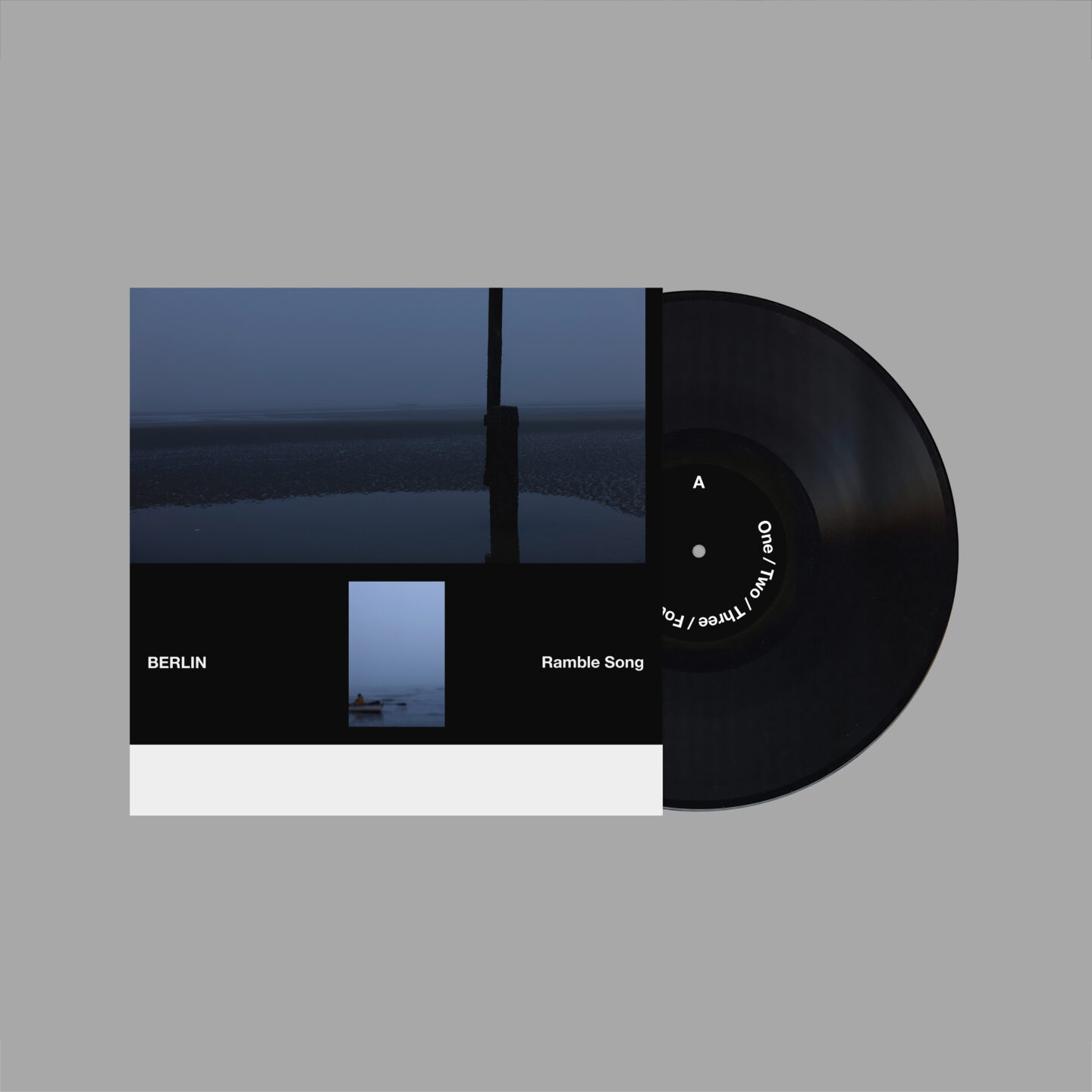
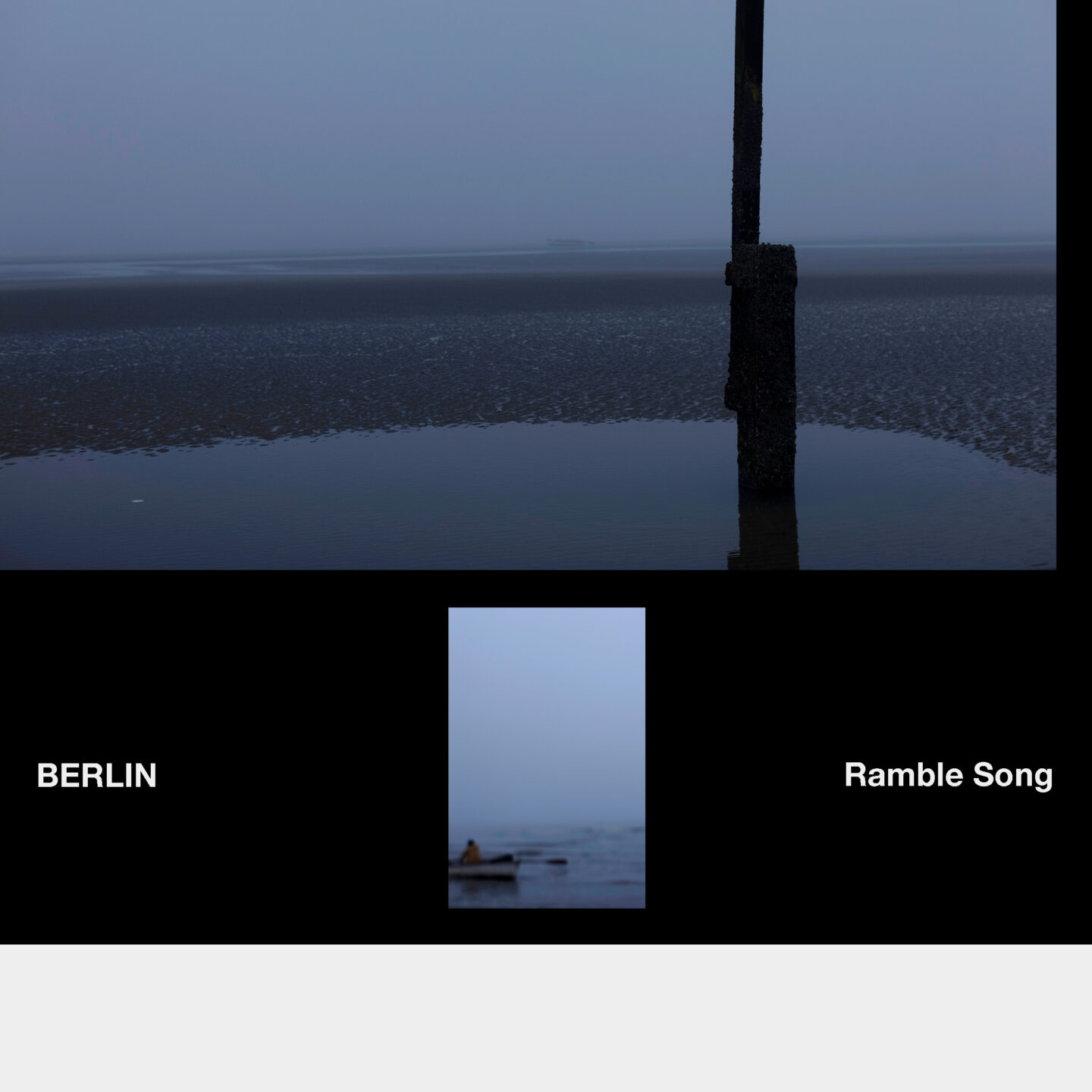
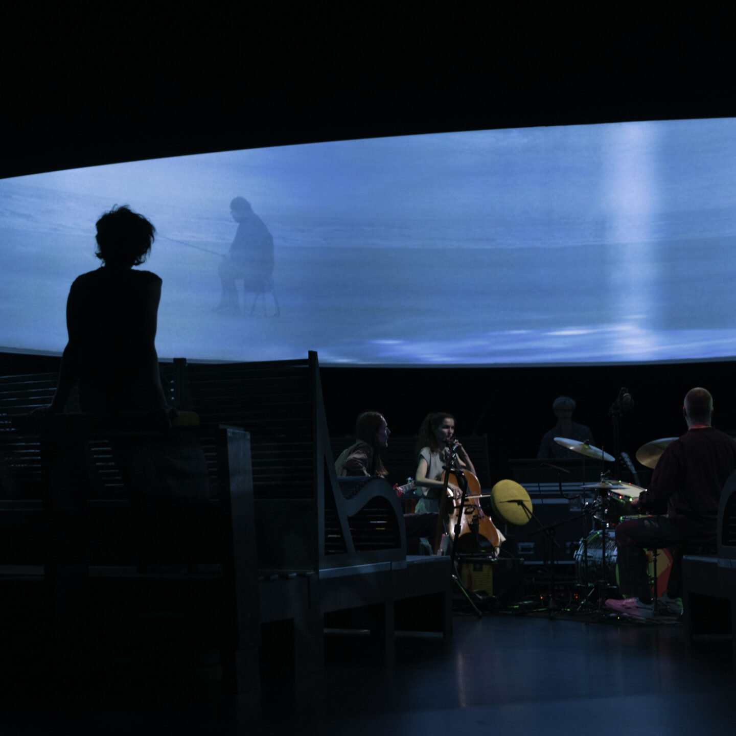
Poster and Vinyl design for the installation and performance called ‘Ramble Song’ by Antwerp based collective BERLIN. With Ramble Song, BERLIN propels music — a driving foundation in earlier work — and the cinematic into the foreground. A poetic ramble full of beauty but also disappointment unravels in a series of tableaux. Ramble Song meanders between melancholy and black humour, inspired by the figure of the drifter — the nomad who cultivates a form of indecisiveness and who lurks in each of us. Onstage there is a theatrical installation. This organism in sleep mode, with something that resembles a continuously audible and visible respiration, is animated through live music and footage. The soundtrack is wide-ranging, featuring echoes of new-classical music but also energetic krautrock and a diversity of synth-driven soundscapes. The daily noise between our ears here gives way to a musical universe that gets crystallized in images — and vice versa. More information on www.berlinberlin.be
Kortrijk Art Weekend / of 4 / More info
New colors, poster, and booklet for the upcoming Kortrijk Art Weekend. @kortrijkart represents over 20 organizations, both private and public, that program and showcase visual arts in Kortrijk. Their website (www.kortrijkart.be) provides a schedule of all current exhibitions and art events happening in the city throughout the year, making it a valuable tool for cultural trips to Kortrijk.
For the visual identity of Kortrijk Art and KAW, we created a language of shapes centered around a basic letter “K,” emphasizing Kortrijk’s central role. The identity and website will evolve along with the collective’s needs and participants. Special thanks to @dietervancaneghem for keeping Kortrijk Art on course. Motion design for KAW by @remydejans


Jowa Identity, 2022 / of 13 / More info
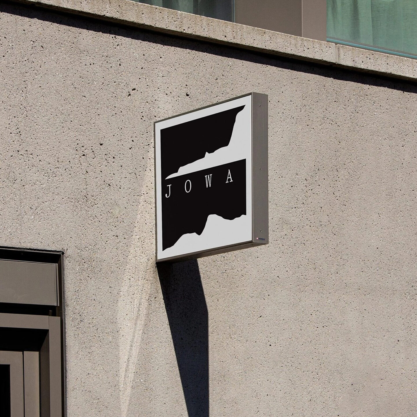
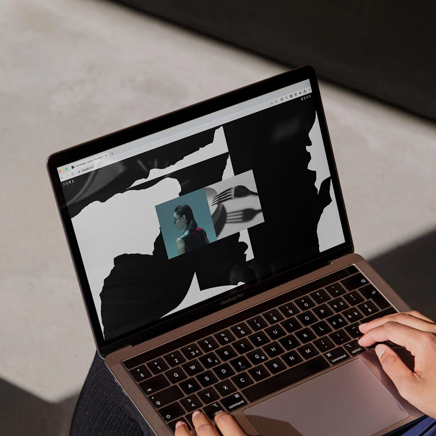
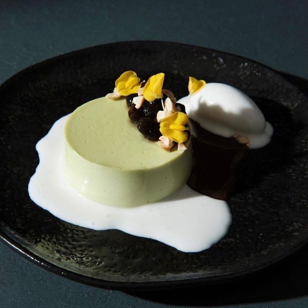
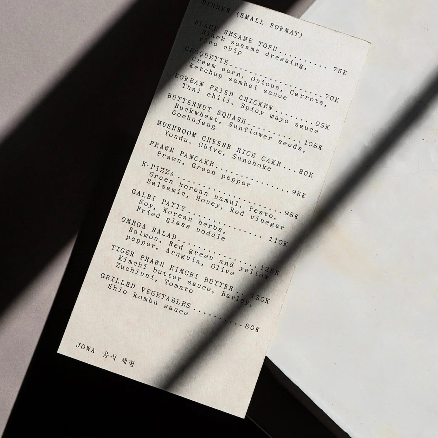
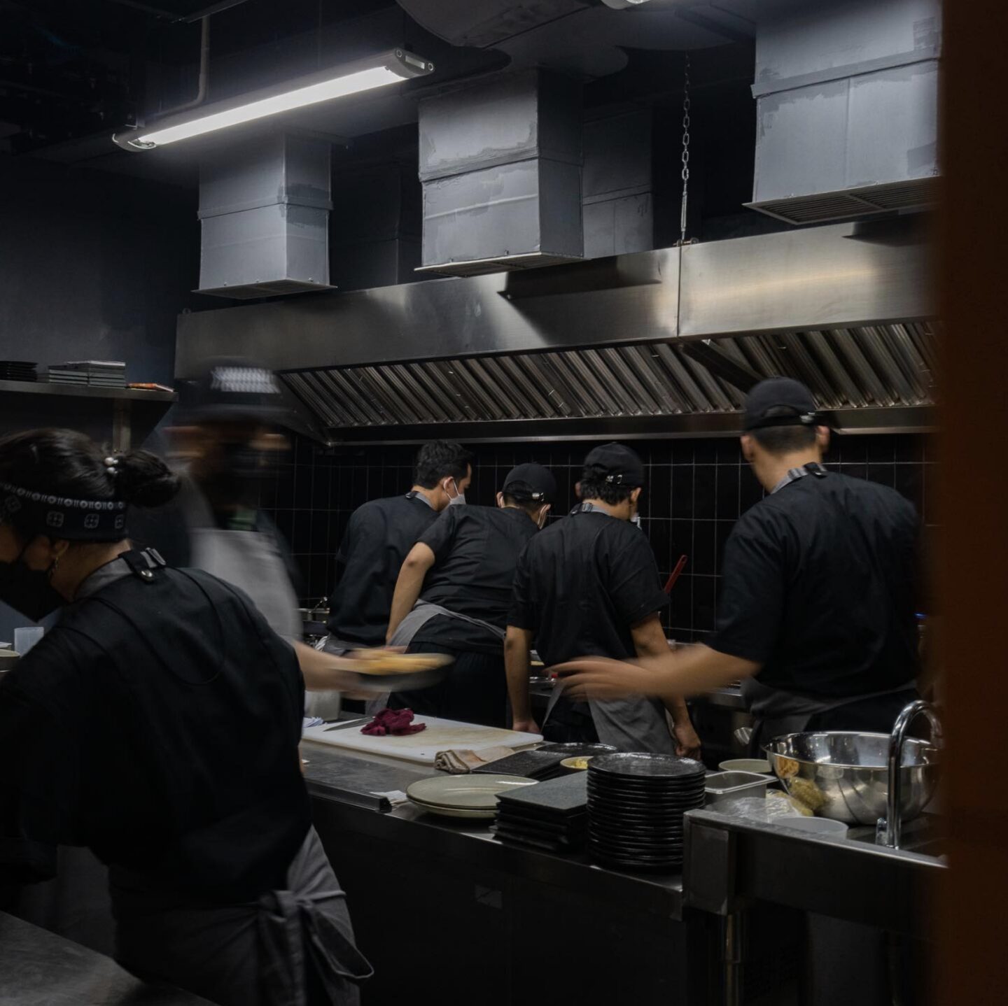
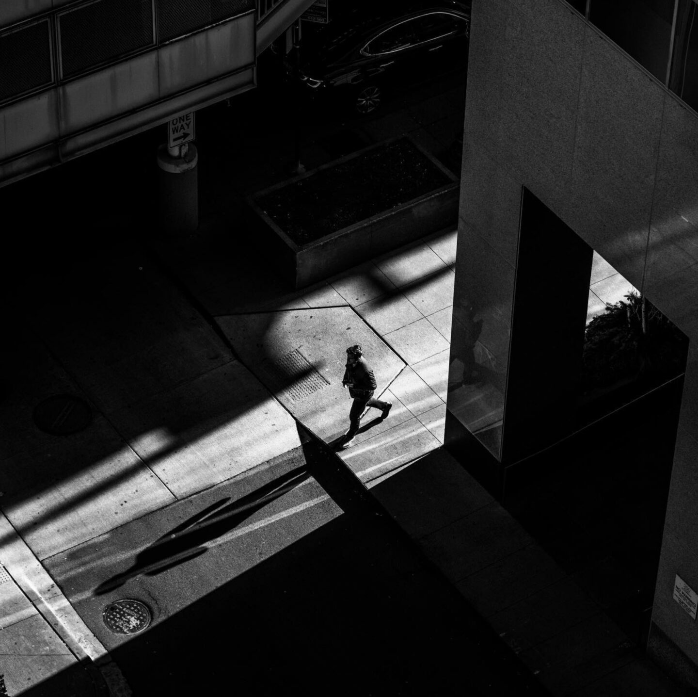
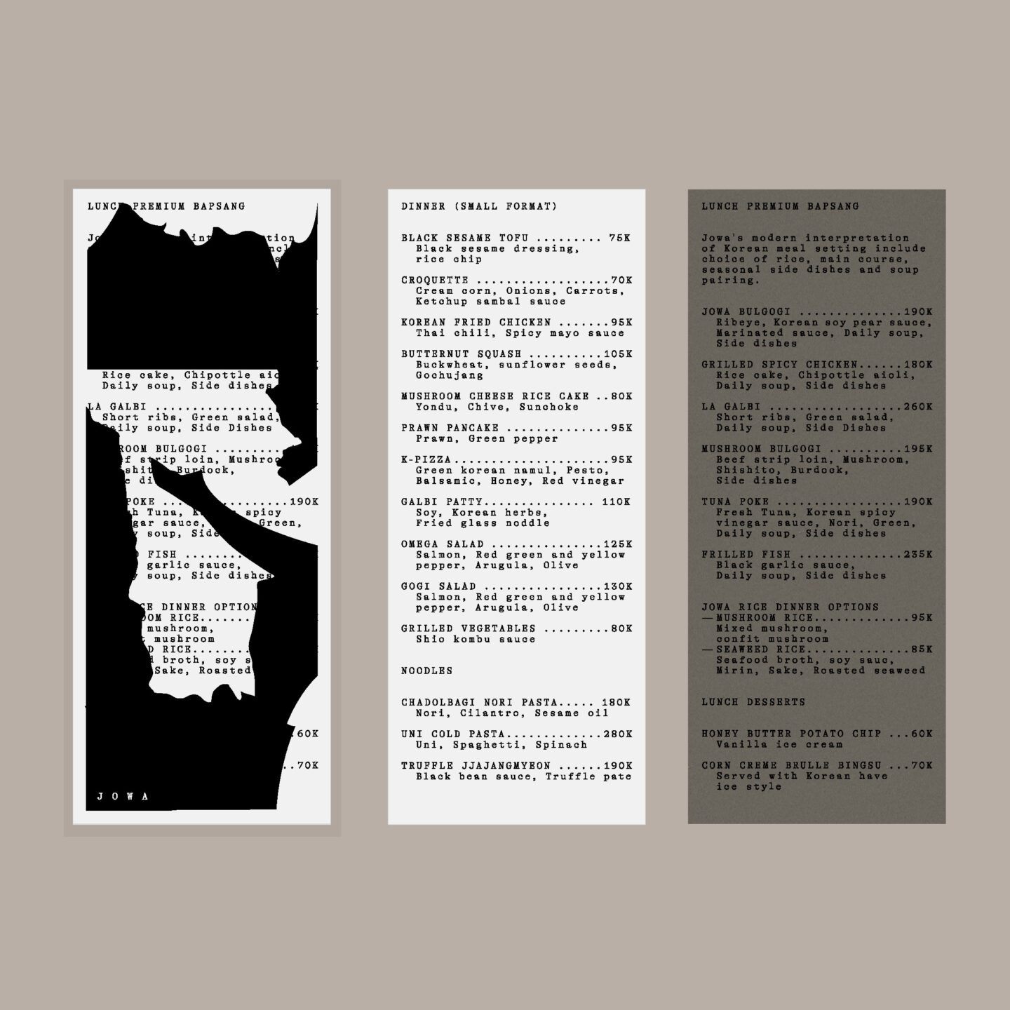
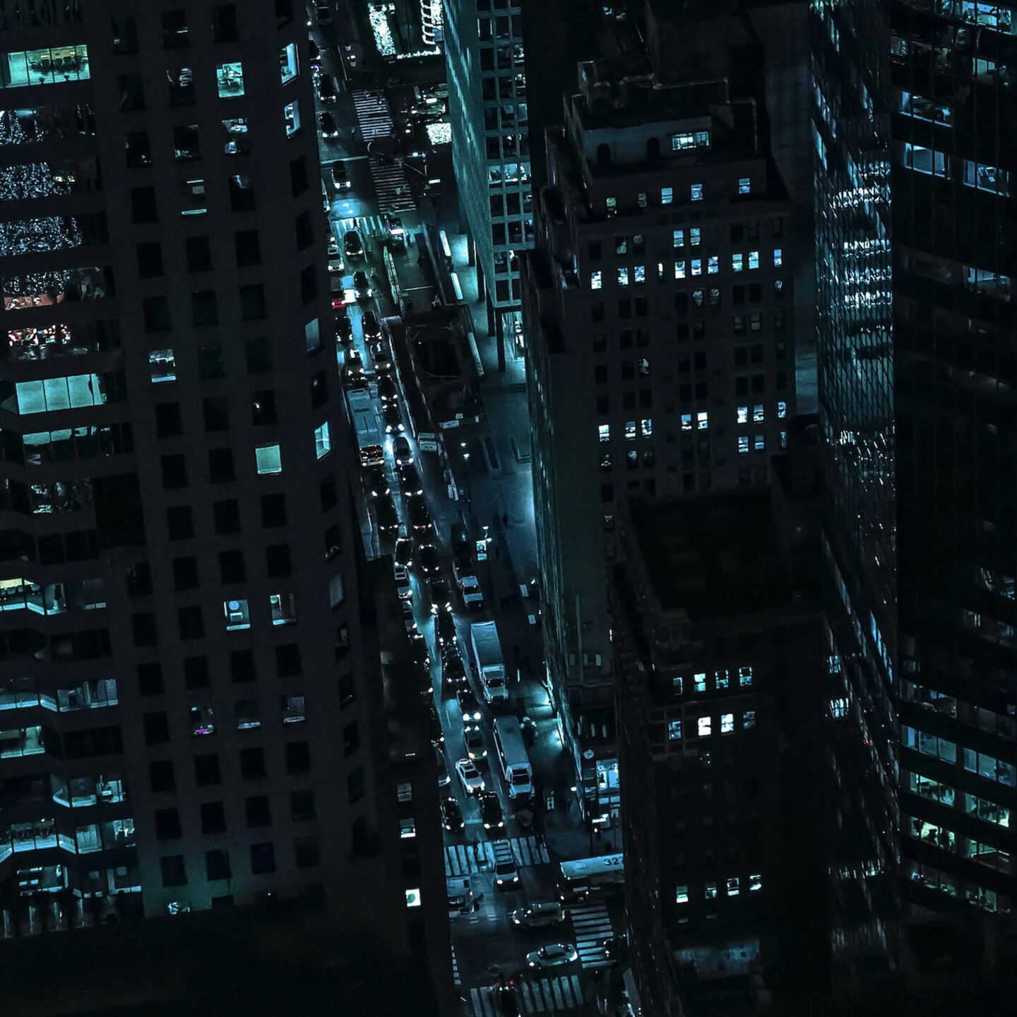
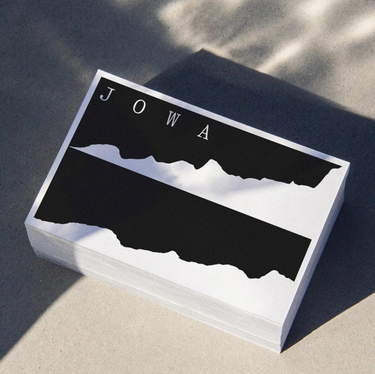
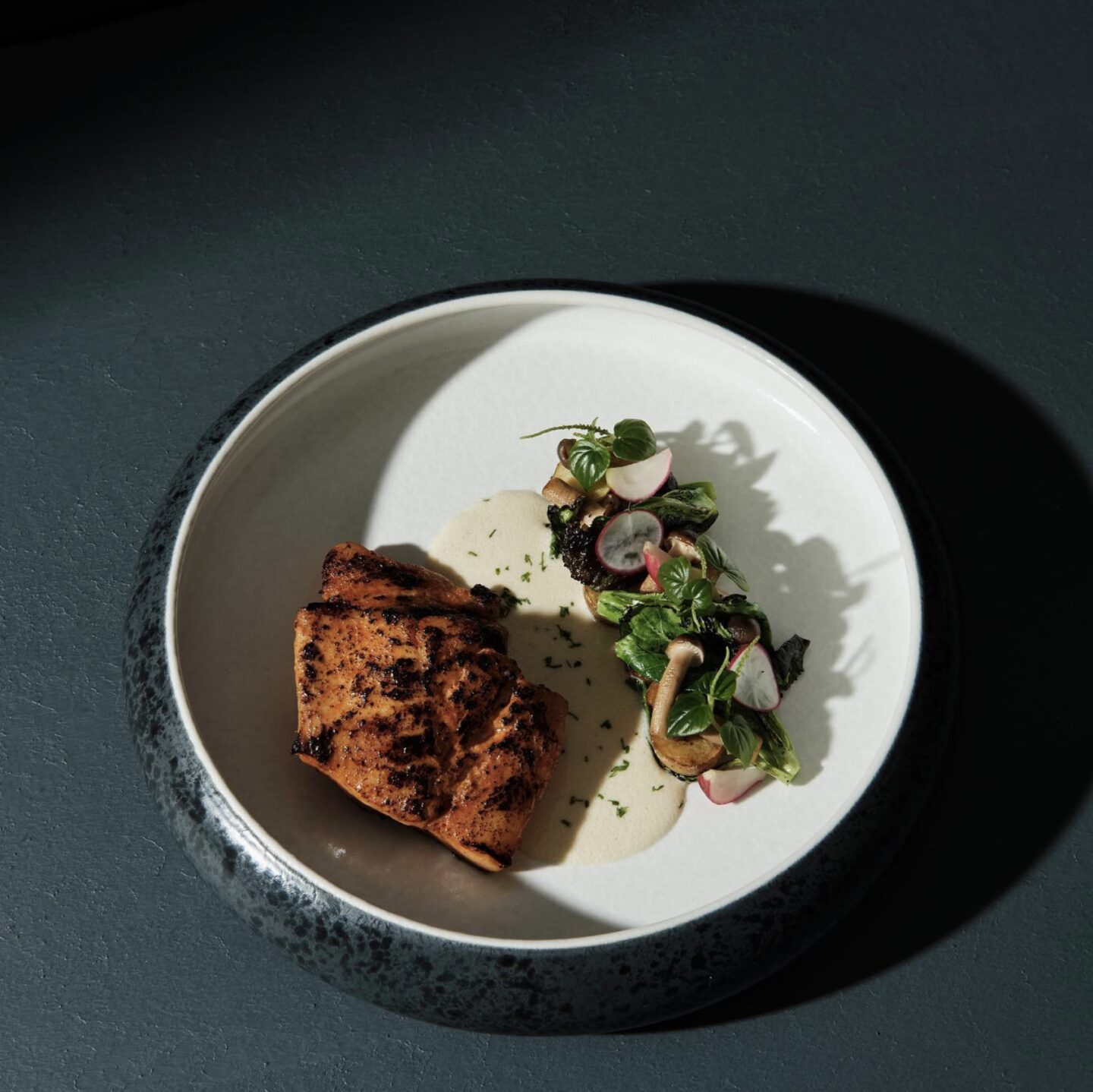
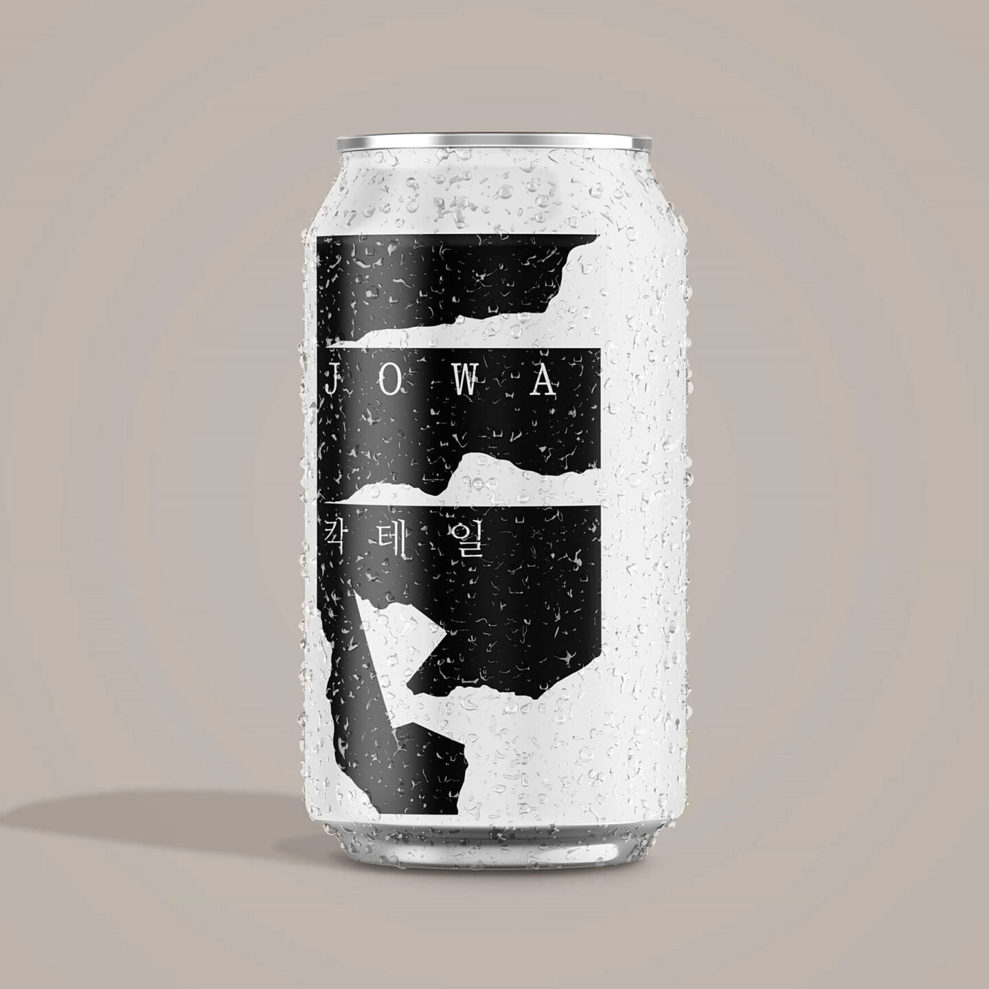
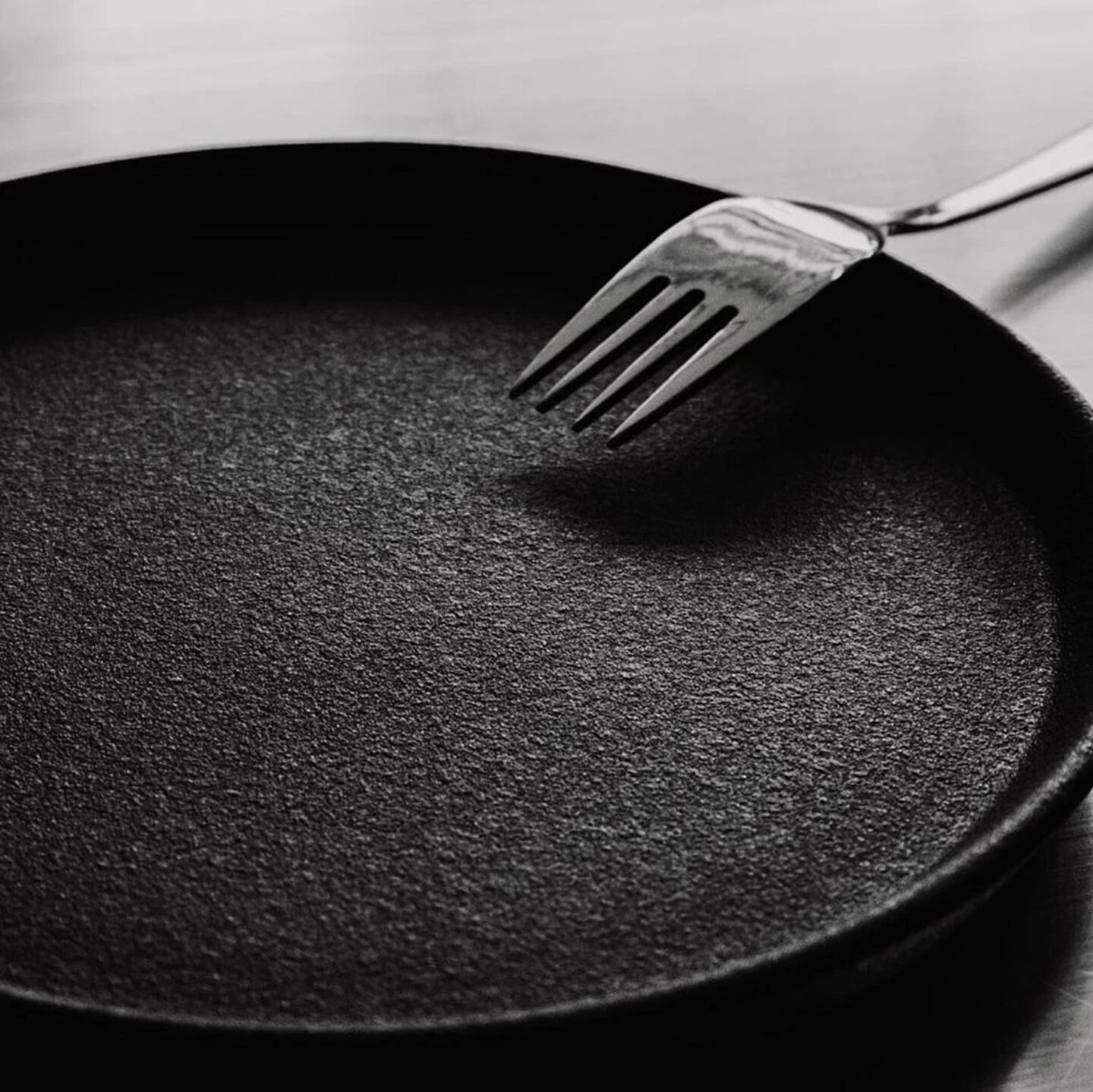
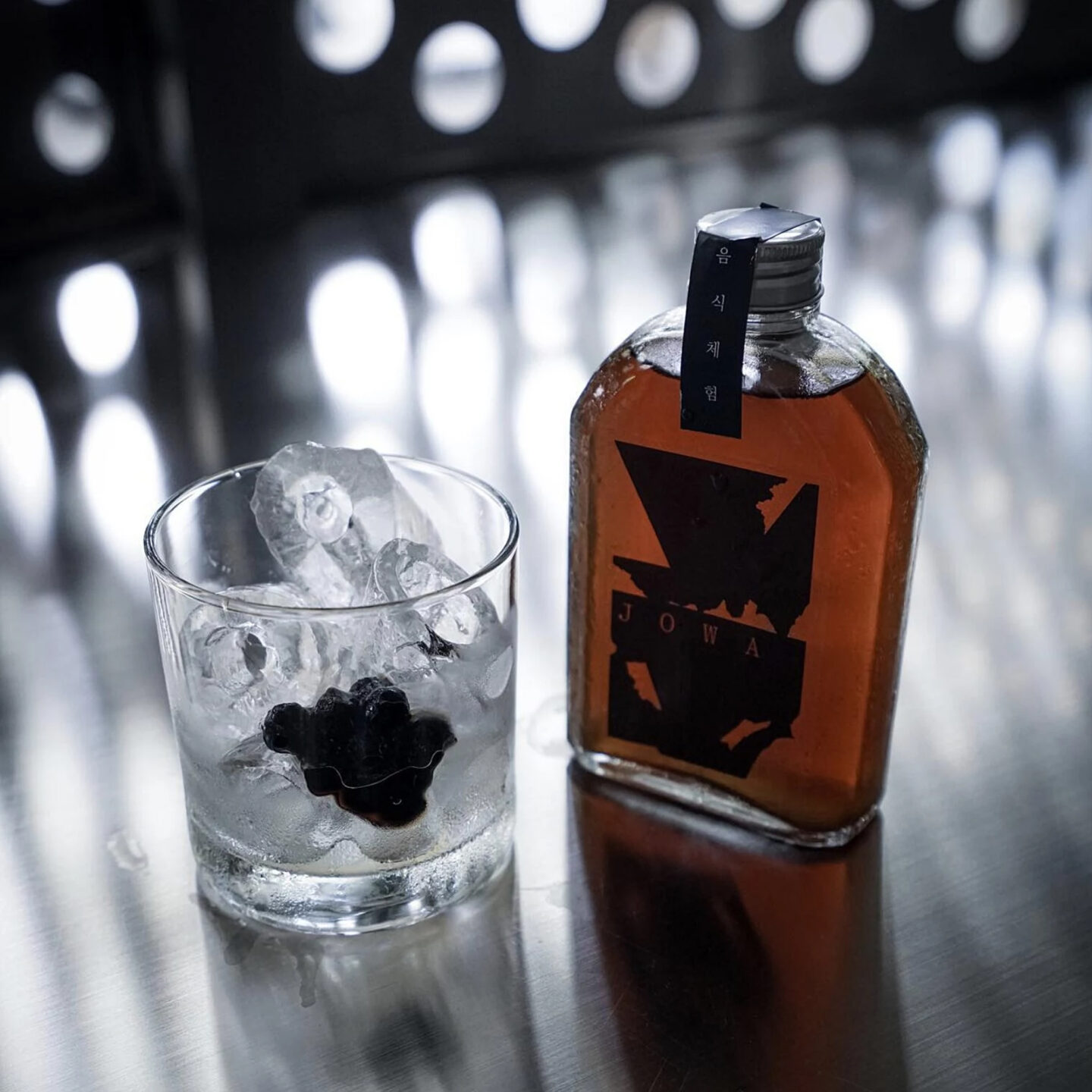
Branding and identity for Jowa in Jakarta. Jowa is a fusion kitchen BBQ restaurant in Jakarta, Indonesia. We wanted to create a unique visual language for this upcoming restaurant in the suburbs of the vivid city. So we started thinking of a way to visualize the coals of a bbq with the way ingredients are handled by a chef in a kitchen. We started drawing these burned-out abstract forms and started cutting straight aggressive lines into them. Just like a very sharp knife would to do a tomato or a piece of beef. The outcome were these abstract figures that worked perfectly in the setting of the restaurant. Inside these rudimental forms we selected a classy typewriter typeface to clash both elements. Together with the client we also produced an approach on food photography and their social media attitude. Making sure this abstract identity was combined with very moody and straight-forward photography of their dishes and interior. Website made together with graphic designer and webdeveloper Mathieu Serruys and intern Ibert Pauwels.
Belgian Art & Design Affair / of 1 / More info
Another post highlighting the typefaces behind the new identity for @belgianartanddesignaffair
A few months ago, designers @verhelstvictor and @corbinmahieu were tasked with designing the next chapter of the @belgianartanddesignaffair . Initially named BAD, then BADF, it is now called BADAFF, the Belgian Art and Design Affair. (like a Love affair) Together with curators @wimlambrecht, @han.decorte, and @_mariemees, they sought to uncover a possible love story behind its identity.
Their goal was to visualize an affair through the new identity. To achieve this, they contacted three young type designers to create a custom love-themed typeface. Mixing these different typefaces would serve as the foundation for the new identity. Victor and Corbin also wanted to highlight that type design is an art form and a category in design. By this way hoping to integrate graphic design within the fair itself. The only rule was that the typefaces had to incorporate hearts. These unique typefaces were crafted by young designers @otisverhoeve, @bureauclaes, and @pino_type.
Each typeface represents different concepts. It could symbolize the unique love affair between a gallery, a buyer, and an artist, or the diverse types of visitors to the fair.
In addition to the typefaces, they aimed to create an iconic visual and different color scheme each year. They wanted to reclaim the symbol of the heart, avoiding kitsch and Valentine-esque designs, to sketch a unique heart. They have different versions prepared for each year.
This is just the beginning. More love incoming!
New website online in collaboration with @mathieuserruys
www.badaff.be
A special thank you to @harryvanhoyweghen and Jan De Geest for their full trust and enthusiasm during this collaboration. Special shoutout to superb type designer @natashaldesign for helping in this project. Also, a big thank you to our intern @nemo.lemoine for all the help! All is full of love 🧡 🔥 💥

The Waiting Room, 2023, Interview / of 1 / More info
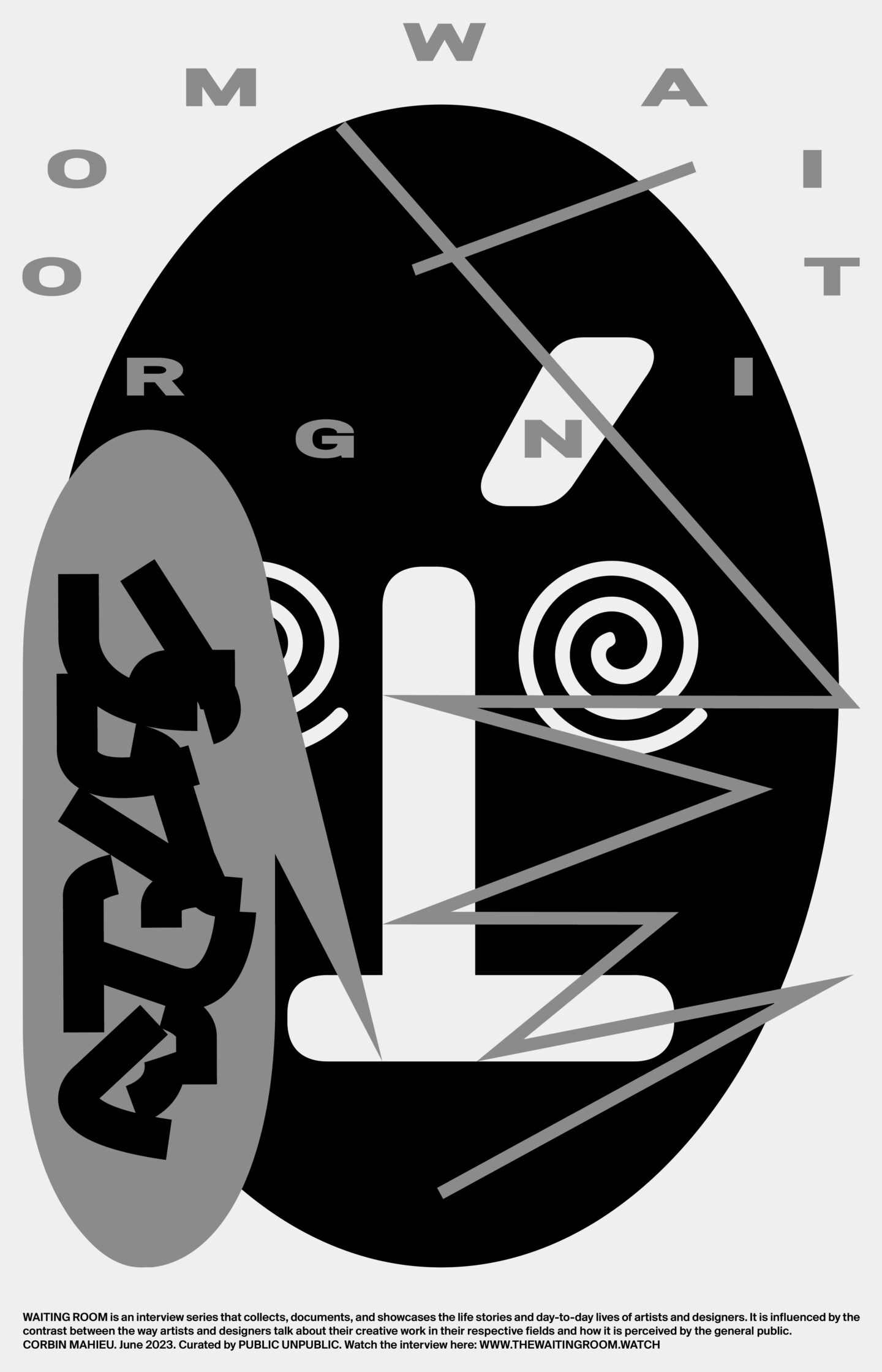
For an interview Corbin Mahieu did called “The Waiting Room”, we created a collaboration poster to promote the new online release. Contact us if you are interested in buying one. (50 prints, signed, 382×594, offset, Silver & Black, 20 euro + shipping (8−14 euro) (Depending on the country) Contact: info@corbinmahieu.be
WAITING ROOM is an interview series that collects, documents, and showcases the life stories and day-to-day lives of artists and designers. It is influenced by the contrast between the way artists and designers talk about their creative work in their respective fields and how it is perceived by the general public. Curated by PUBLIC UNPUBLIC The All Night Workers Division. Read the full interview here www.thewaitingroom.watch
Robbrecht en Daem architecten, 2022 / of 5 / More info
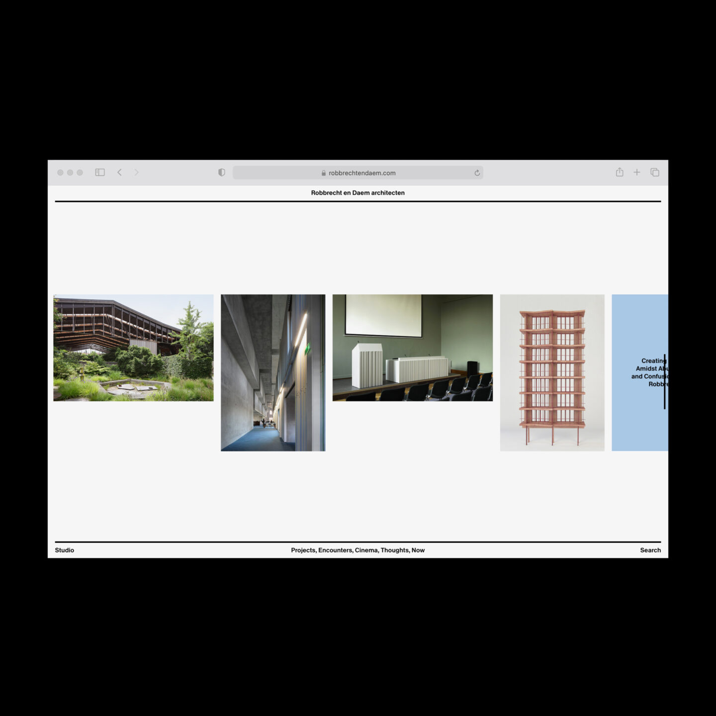
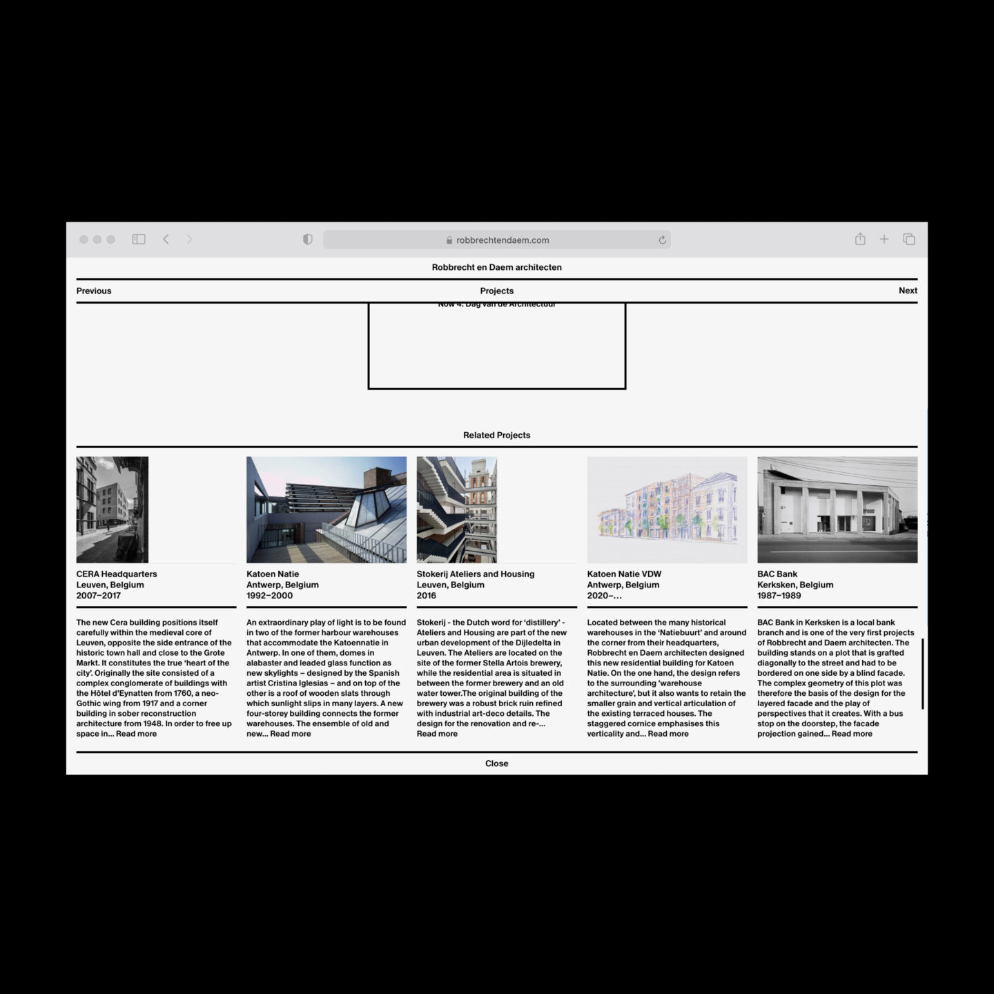
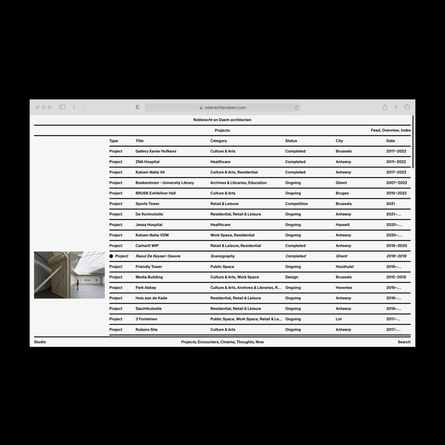
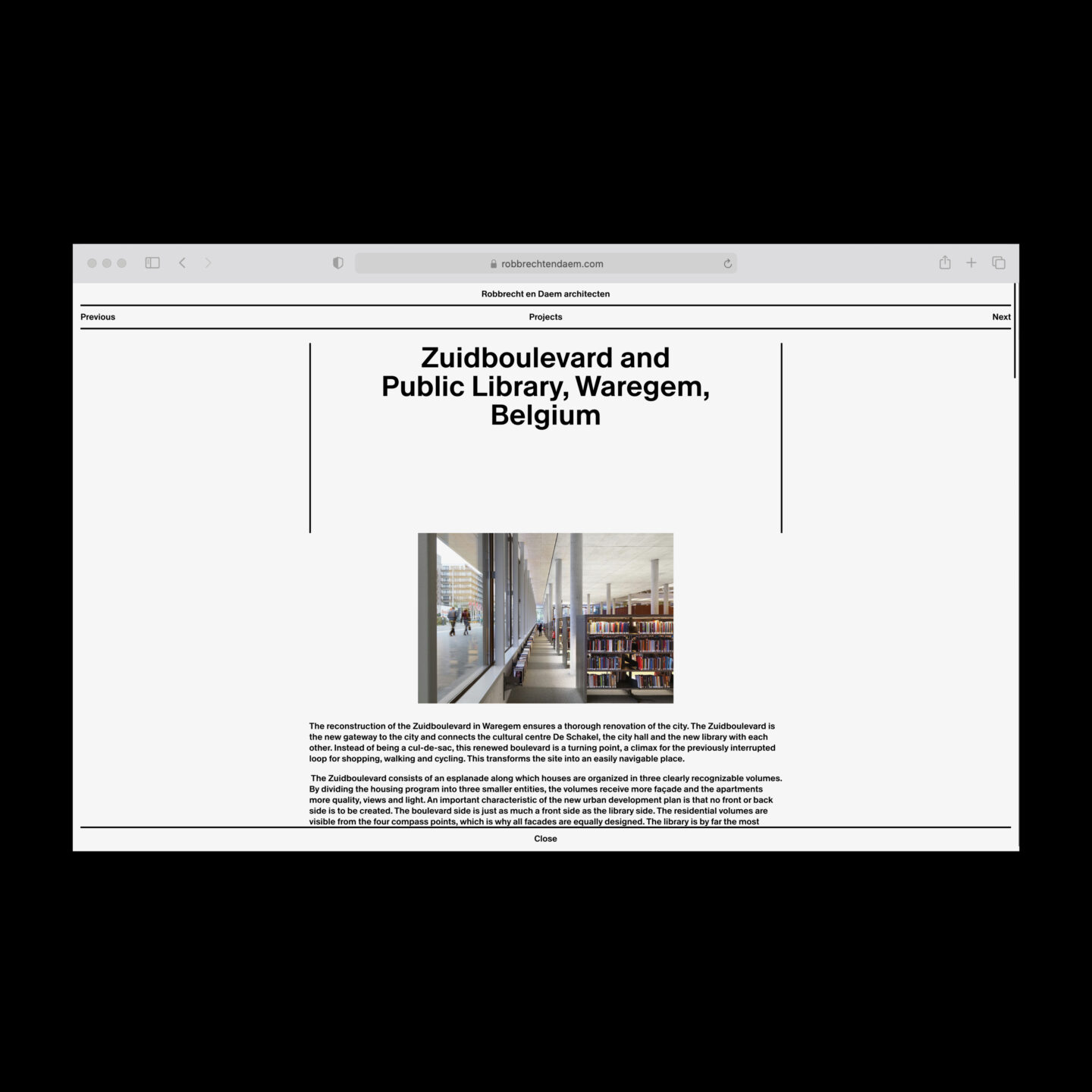
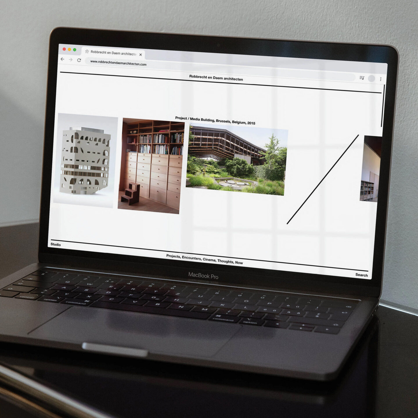
We were asked to design the new website of respected Belgian architects Robbrecht & Daem. The website follows a very strict grid and plays within the limitations of these self-made choices. Following Robbrecht en Daem’s unique counting system called “Louie” (Named after the American architect Louis Kahn) the website only uses lines and one weight and height of a grotesk typeface to make a logic viewing system. Referring to architectural plans or sketches and the way a building is based on layering the correct materials. We hope you get lost and are challenged by the unconventional interface, when going through their projects, encounters and thoughts. Besides this minimalist system, we also tried to included the use of a visual horizon. We wanted this concept to be the starting point of the homepage. We hope viewers experience a virtual landscape of buildings or projects going from left to right. Their unique approach on design needed to have a unique digital outcome. Besides this portfolio website we also helped to to create a personal digital database and made sure their newsletters are made automatically. Project together with web developer Rein van Oyen. Visit the website www.robbrechtendaem.com
Funke, Identity, 2022 / of 7 / More info
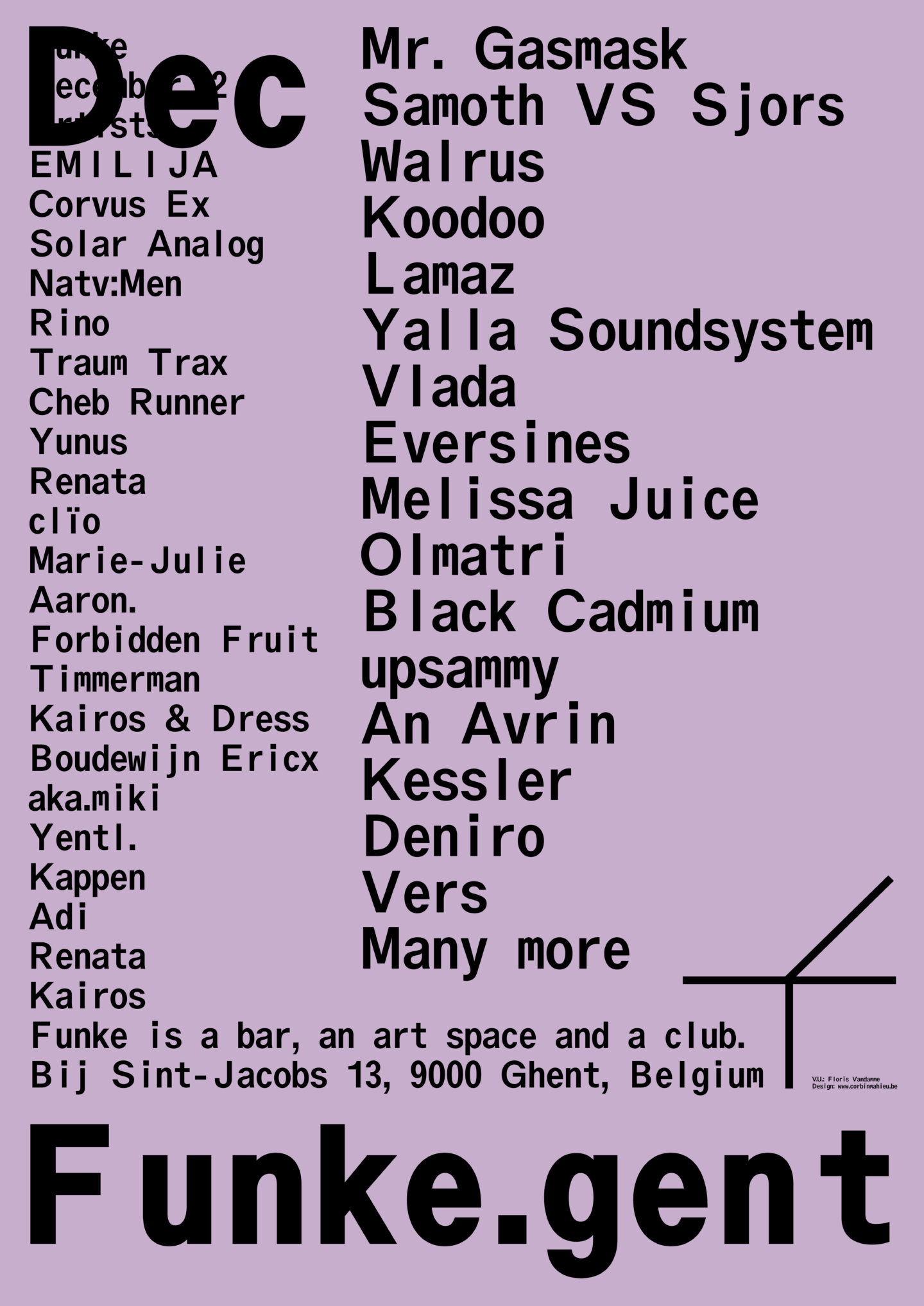
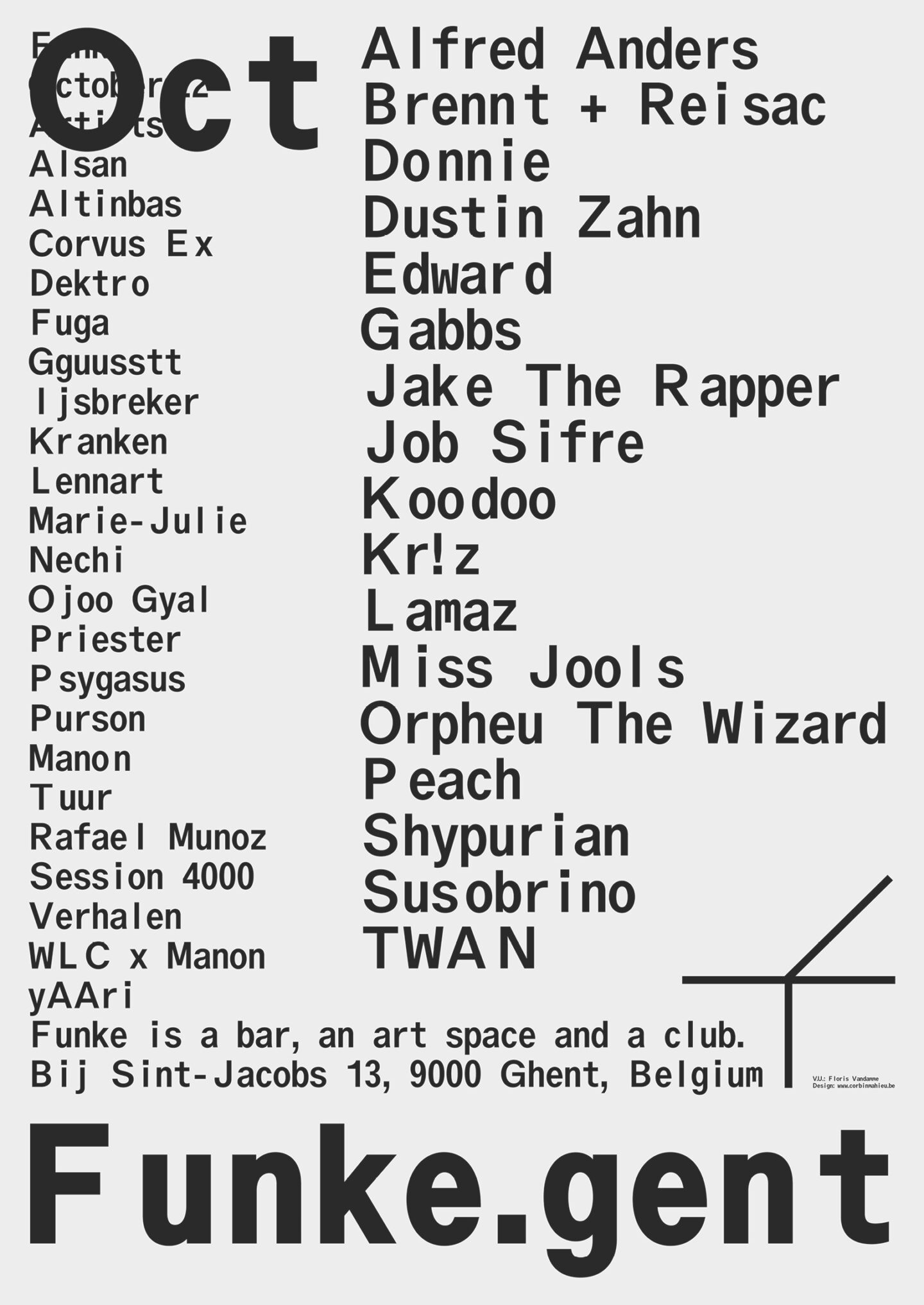
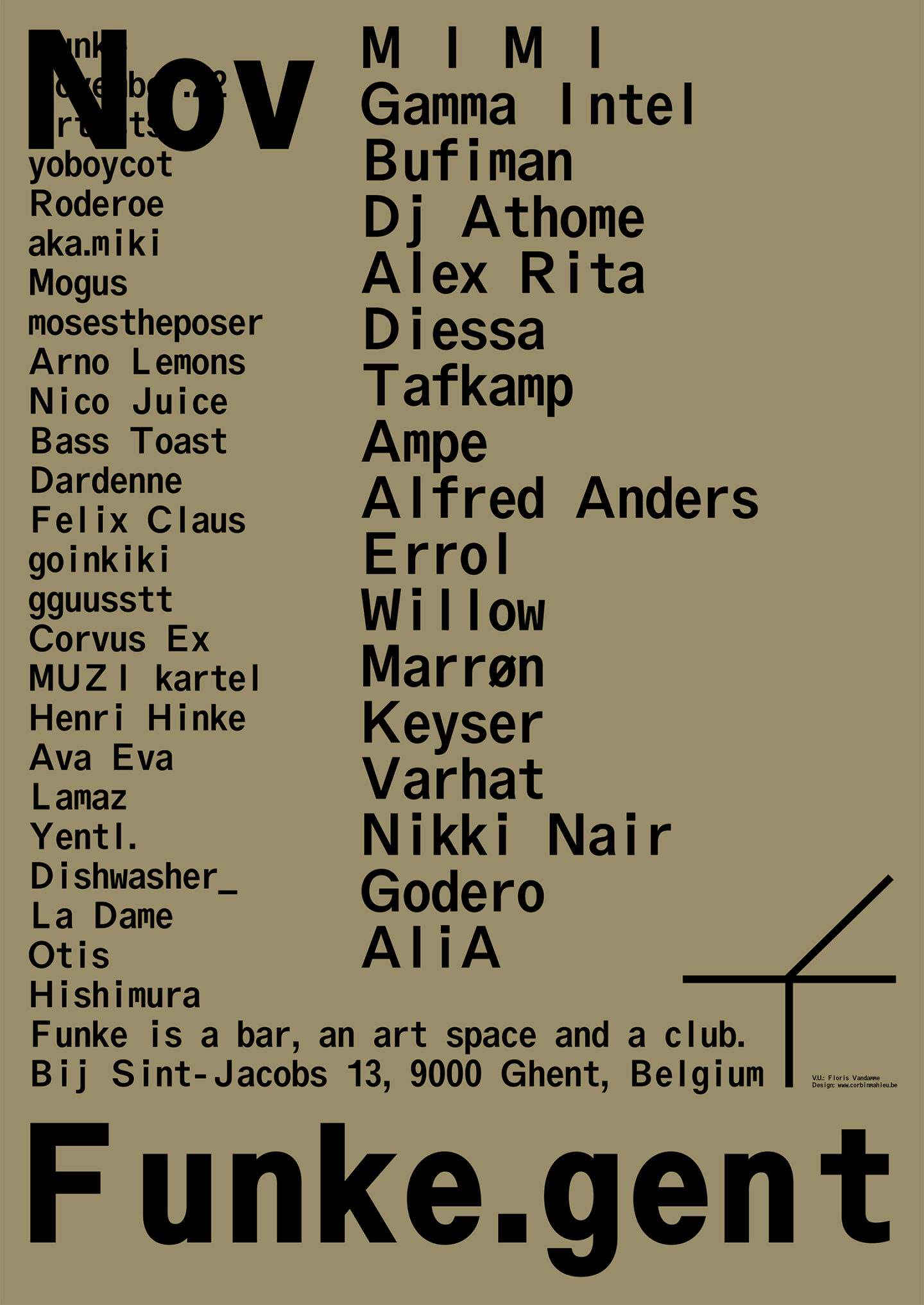
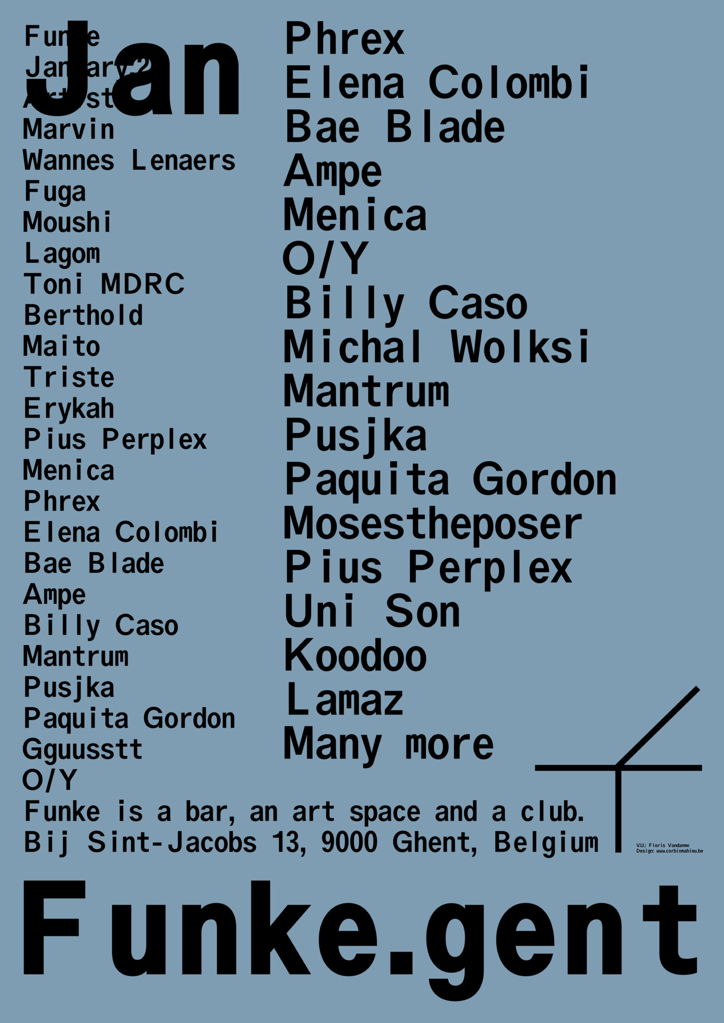
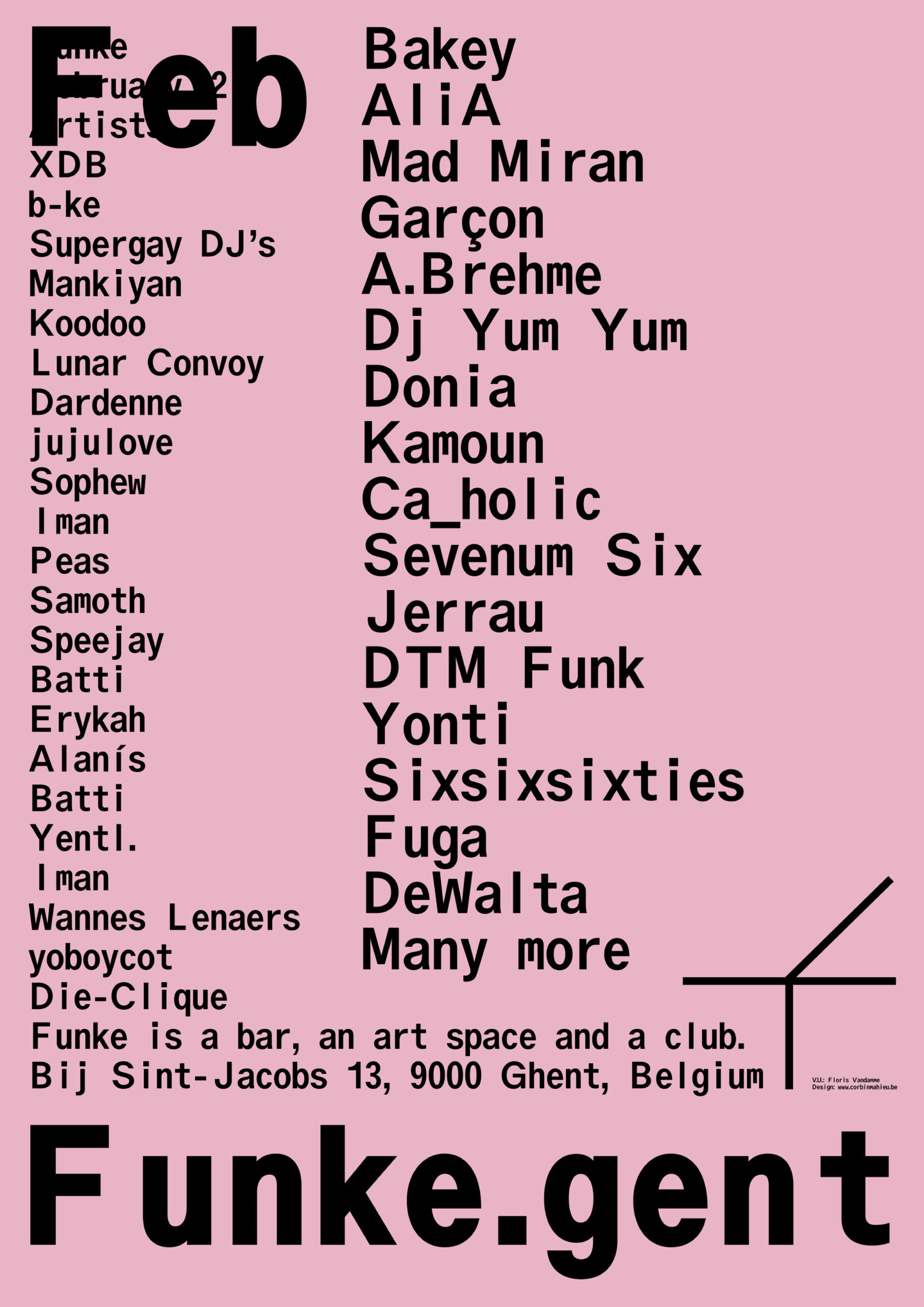
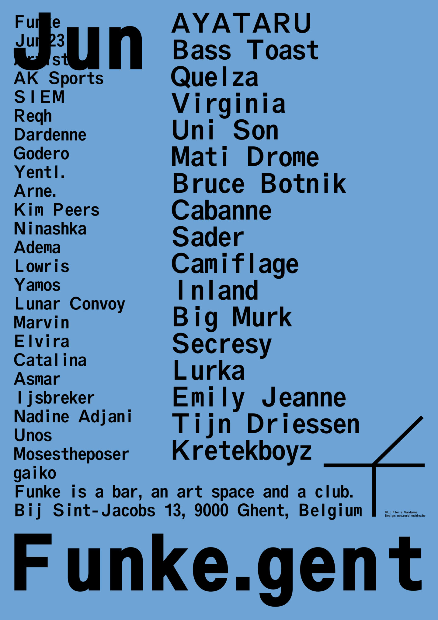
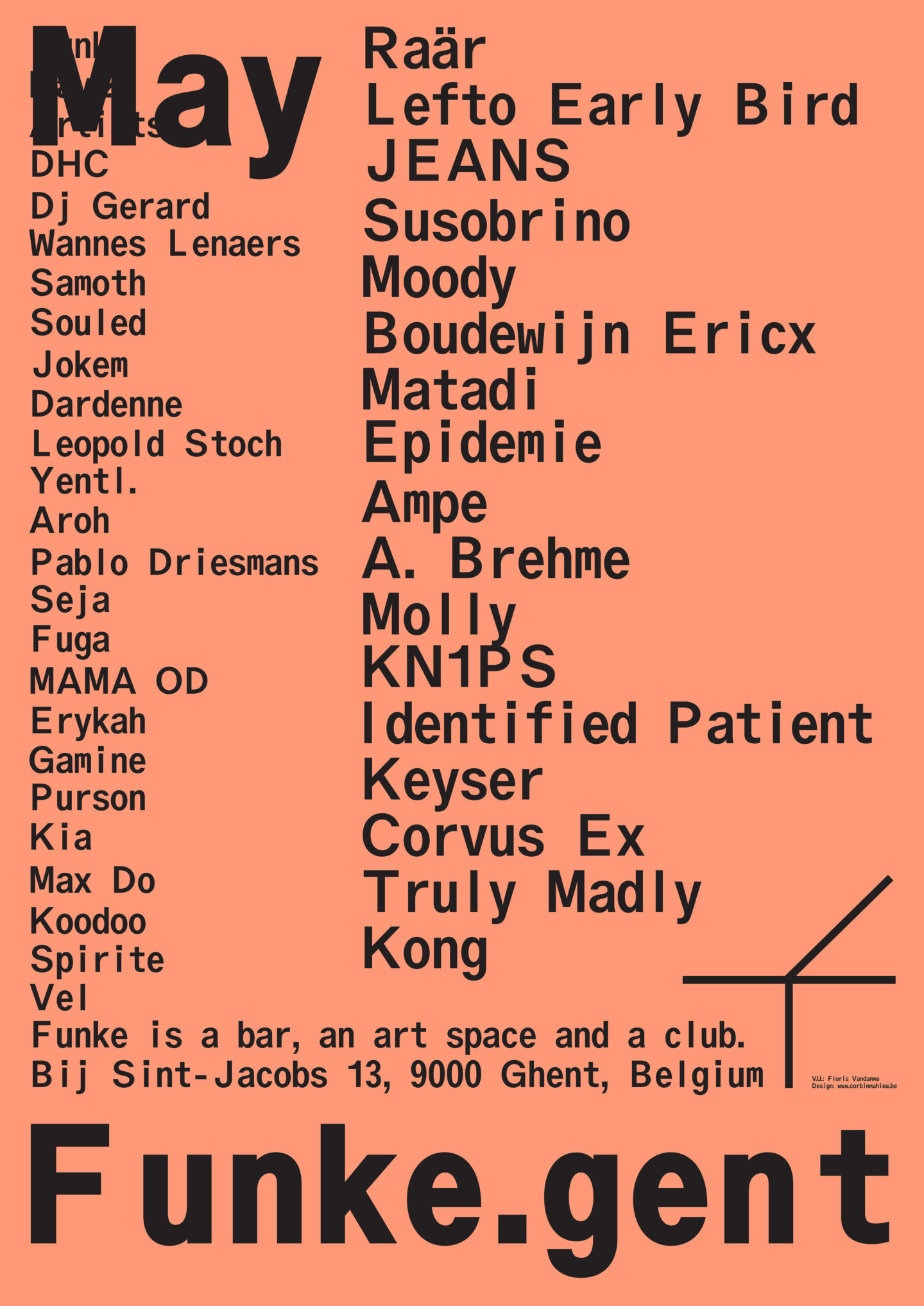
In 2022 we designed the new identity for Funke. We made an easy-to-use approach for the daily facebook eventbanners, social media slides and stories. Funke is a bar, art space and club in the center of Ghent. Every month the identity has another color connected to the seasons. Together with the people behind Funke and the communication team we are looking for other improvements on the already existing approach for the following years.
